
Quiet luxury within an interior is far more than a carefully selected shade of neutral paint.
If with a garment it’s about the cut of the fabric, the quality of the yarn and a restricted palette, resulting in a functional yet timeless piece of clothing, then with wallcoverings it’s surely about the integrity of the production, the finish of the material and its interaction and function within a room.

Erica Wakerly’s design ethos has always been about an understated, timeless quality.
Our wallpapers are made in Britain by revered printers and the print marks across all our papers are formed by layers of rich pigments, akin to silk screen printing. Colours are mixed by eye – a highly skilled, very human process.
This results in a hand-crafted feel.

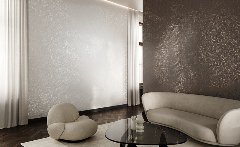
Angles, Leaf or Fan in the pewter / white stone and bronze metallic colour ways provide a neutral palette with a fine reflective line running throughout. The way the foils softly interact with light once installed, bring a depth to the walls and a nuanced atmosphere, denoting a sense of luxury.
The patterns lay low and work ‘with’ rather than competing against the furniture in a space. They add a layer of warmth and tone, contributing to the overall material palette of an interior.

The Modern Flock collection comprises patterns with a velvet finish, also softening the acoustics in a space. The tone on tone options e.g. Scoop black flock, provide a sumptuous and harmonious finish.
The sculptural quality of Buzz and Scoop white flock / white bring a minimal and refreshing sense of modernity.

Across the range, the colours have depth and are sometimes slightly imperfect. These subtle touches and differences bring a character and warmth to the surfaces and entice you to take a closer look.
So think beyond an instant hit of colour and pattern when selecting your wallpaper. Consider a design which carries a timeless intelligence and elegance.
It may well also be something you enjoy living with for longer.
SEE ALSO:

Go Pop with Pattern and Colour
Designing an interior using a monochrome, graphic wallpaper as a backdrop to bursts of color and texture.Read more…

New Brochure (Autumn 2023)
Explore our current designs and materials, and learn more about our design processes and ethos. Find inspiration for your project. Download here…

Paint a picture
A selection of paint shades that get our seal of approval and work best with our wallpapers. Read more…

Where there’s a wall there’s a way
Looking at how to use Erica Wakerly wallpapers in a range of ways to create different effects. Read more…

Collaboration with KAZA: 3D wall tiles
Erica Wakerly’s collection of 3D ‘Form’ wall tiles for Kaza, are designed to be used in any combination, for minimum or maximum impact. Read more…

The Polly Dunbar Decoration collection
How renowned illustrator and author Polly Dunbar and Erica Wakerly created the intriguing and beautiful wallpaper collection ‘Wallflowers’. Read more…